Key Takeaways
- Kit design has reached a historic turning point in the tournament history with brands mixing 1990s shapes and modern cultural details.
- Nostalgia acts as the primary winner this year with subtle national folklore patterns outperforming plain minimal structures.
- Overly basic templates or jarring color additions have placed several prominent footballing nations at the bottom of the fashion chart.
- Minor football nations have broken expectations by creating some of the most memorable and unique visual looks on the world stage.
Welcome to the Greatest Fashion Show on Earth
The global tournament has arrived and the energy across the host nations is higher than ever before. While coaches focus on tactical setups and players prepare their fitness routines, fans have their eyes locked on a completely different asset. We are talking about the clothing. International football jerseys are no longer just basic pieces of athletic gear meant to help referees separate two teams on a grassy field. They have turned into highly valued cultural items, luxury street fashion choices, and historic badges of national pride.
When you look at the fields this summer, you will see forty-eight different countries showing off their unique identities through thread and dye. This tournament is the largest version of the event in history, which means we have more jerseys on display than ever before. Major sports brands have spent years planning these releases, trying to find the sweet spot between running comfort and artistic beauty. Some brands looked deep into their historical archives to bring back shapes from the golden eras of the past, while others used local art to tell completely fresh stories.
The result of this massive design effort is a wonderful mix of colors, patterns, and cultural themes. However, not every risk taken by a designer leads to a trophy. For every masterpiece that makes fans race to the online stores, there is a painful mistake that makes people wonder how the final product got approved. In this ultimate kit tracker, we will break down the absolute best and worst shirts on display during this tournament. We will look at the tiny details, the background stories, and the visual impact that these shirts make from a distance.
Whether you are looking to buy a new shirt to wear around your local neighborhood or you just want to debate with your friends during the half-time breaks, this guide has you covered. Let us dive straight into the beautiful, the bold, and the downright ugly shirts of the year.
The Masterpieces: Ranking the Best Kits of the Tournament
The top shirts of the year succeed because they manage to tell a compelling story without losing their visual balance. These choices are instantly recognizable from the upper sections of a massive stadium, yet they offer stunning details when you view them up close in person. Here are the top shirts that have captured the hearts of fans across the planet.
Curacao Away: The Caribbean Masterpiece
The Visual Elements
The absolute shock of the tournament does not come from a traditional football giant. It comes from the island nation of Curacao. Their secondary shirt is a masterclass in how to celebrate a country through a piece of sports clothing. The base of the shirt features a beautiful, soft lemon tone that feels incredibly fresh under the bright summer sun. Across this light background, the brand has mixed a gorgeous display of multi-colored stripes along the shoulders.
The Cultural Significance
This shirt works so well because it acts as a direct love letter to the capital city of Willemstad. The unique shades used in the trim reflect the famous colonial buildings that line the waters of the island. It is a brilliant mix of history and modern street fashion. The shirt feels light, happy, and filled with the warm spirit of the Caribbean. It proves that you do not need a century of football trophies to win the fashion competition. Fans who have no personal connection to the island are buying this shirt purely because it looks like an incredible summer outfit.
Mexico Home: Aztec Power Reimagined
The Visual Elements
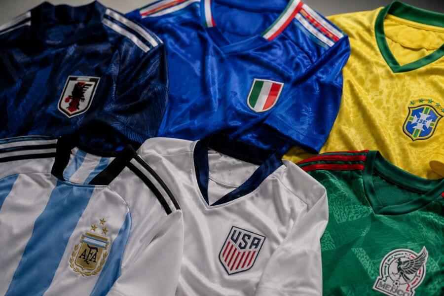
Mexico always brings intense passion to the international stage, and their primary shirt for this tournament matches that energy perfectly. The shirt is built on a deep, rich green base that instantly screams traditional Mexican football. However, the real magic is hidden within the fabric itself. An intricate, sprawling overlay pattern covers the entire shirt, showcasing the iconic Aztec sun stone calendar.
The Cultural Significance
This design is a beautiful throwback to the famous, wild Mexican shirts of the late 1990s, but it cleans up the messy look of that era with modern manufacturing. The pattern is bold enough to be seen clearly by the television cameras, yet it feels elegant when paired with the clean white shorts on the pitch. The striped collar adds a sharp, classic frame to the shirt, ensuring that the heavy ancient graphics do not overwhelm the person wearing it. It is a flawless celebration of ancient history and modern athletic pride.
Ghana Home: Folklore Caught in a Web
The Visual Elements
Ghana has consistently rolled out beautiful shirts over the past decade, but this year they have taken things to an elite level. The primary shirt features an incredibly clean, crisp white base. Sitting right in the center of the chest is the iconic black star, which serves as the core symbol of the national team. From this star, a beautiful series of hand-drawn black lines spread out across the torso, forming a subtle, beautiful web pattern.
The Cultural Significance
The web pattern is not just a random artistic choice. It is a direct reference to Ananse, the legendary spider from West African folklore who represents wit and wisdom. The lines look like they were sketched by a master artist using a fine pencil. To complete the look, vibrant hits of red, yellow, and green from the national flag decorate the sleeves and collar. It feels deeply personal, highly artistic, and completely unique to the nation of Ghana.
Japan Away: White Diamond Pinstripes
The Visual Elements
Japan has established a reputation as the undisputed king of clean, wearable soccer fashion, and this secondary shirt keeps that reputation alive. The shirt uses a clean, off-white background as its canvas. Running vertically down the shirt are twelve ultra-thin, rainbow-colored pinstripes. The dark black accents on the collar and the classic retro brand logo provide a heavy, grounded frame for the colorful lines.
The Cultural Significance
The design takes inspiration from traditional Japanese baseball uniforms, bridging the gap between two of the most popular sports in the nation. The twelve stripes carry a beautiful meaning: eleven lines represent the hard-working players on the pitch, while the central red line symbolizes the collective football family and the supporters watching from the stands. It is a shirt that looks like high-end casual wear, making it just as suitable for a music festival as it is for a high-stakes match.
Germany Home: Unmistakably German
The Visual Elements
This shirt is a historic release for the European powerhouse. It serves as the final home shirt produced by their long-time domestic clothing partner before a major brand switch takes place in the future. The designers clearly wanted to go out with an absolute classic. The shirt utilizes the traditional white base but incorporates a massive, bold shoulder graphic featuring the black, red, and gold colors of the national flag.
The Cultural Significance
The heavy gradient on the shoulders is a direct nod to the iconic 1990 tournament kit, which is widely considered one of the greatest football shirts ever made. By bringing back those sharp geometric vibes and combining them with a sleek, tight modern fit, the brand has created an instant collector’s item. It feels incredibly powerful, serious, and deeply tied to the rich winning history of the nation.
The Disasters: Ranking the Worst Kits of the Tournament
While some designers deserve praise, others need to explain what went wrong during the production phase. The following shirts fail because they are either completely boring, feature terrible color combinations, or ruin a classic look with strange modern choices. Here are the shirts that have missed the target completely.
Croatia Home: Ruining a Sacred Grid
The Visual Elements
Croatia possesses one of the most famous and sacred designs in all of global sport: the red and white checkerboard pattern. It is almost impossible to mess up this look because the checkers are inherently striking and powerful. Unfortunately, the brand decided to alter the scale of the pattern for this tournament. Instead of the classic, medium-sized squares, the new shirt uses massive, oversized blocks that look awkward on a human torso.
The Cultural Significance
By making the red and white squares so large, the shirt loses its traditional energy and ends up looking like a giant, moving finish line from a car race track. The pattern distorts when the players move across the pitch, making the uniform look like a cheap tablecloth rather than an elite piece of athletic gear. It is proof that you should never try to fix something that is already perfect.
Switzerland Away: A Green Disaster
The Visual Elements
Switzerland is famous for its classic red and white color scheme, which mirrors the national flag. However, for some bizarre reason, the design team decided to introduce a bright, fluorescent green tone into the secondary shirt this year. The shirt features a dull white base, a tiny Swiss cross emblem, and massive hits of neon green along the sides and underarms.
The Cultural Significance
Switzerland has absolutely no historical or cultural connection to the color green. When the players take the pitch wearing these tops paired with their traditional bright red shorts, the visual result is genuinely painful to look at. It looks like a walking Christmas tree or a construction safety vest. The shirt tries so hard to look modern and edgy that it completely forgets what country it is supposed to represent.
Canada Home: Boring and Garish at the Same Time
The Visual Elements
As one of the main hosts of this massive tournament, Canada had a golden opportunity to make a massive visual statement to the rest of the world. Instead, they will step onto the pitch in a shirt that looks like a basic practice top you could buy off the clearance rack at a local sporting goods store. The shirt is solid red with a strange, asymmetrical split collar that looks half-finished.
The Cultural Significance
There are no subtle maple leaf patterns, no nods to indigenous art, and no references to the beautiful cold landscapes of the country. It is just a flat, uninspired block of red fabric. To make matters worse, the specific shade of red chosen feels overly bright and plastic under stadium lights. It is a massive missed opportunity for a nation celebrating its biggest moment in soccer history.
Ecuador Home: The Forgotten Template
The Visual Elements
Ecuador enters the tournament with a highly talented squad, but their wardrobe is severely lacking. Their primary shirt is a plain yellow top with a basic blue trim around the sleeves and the neck. There is absolutely no texture, no pattern, and no creative layout to be found anywhere on the front or back of the jersey.
The Cultural Significance
It feels as though the design team ran out of time and simply copied a basic training template from their warehouse catalogs. While simple designs can sometimes look elegant, this specific shirt just looks incredibly cheap. A tournament of this size demands something special, and this shirt fails to offer even a single memorable detail for the loyal fans who are spending their hard-earned money to support the team.
Saudi Arabia Goalkeeper: The Optical Illusion
The Visual Elements
While outfield players usually get the most attention, the goalkeeper shirts this year have provided some wild designs. The absolute worst of the bunch belongs to Saudi Arabia’s shot-stoppers. The shirt features a chaotic swirl of purple, pink, and black lines that look like a broken television screen or a bad psychedelic trip.
The Cultural Significance
While goalkeeper shirts from the 1990s are famous for being wild and colorful, this specific design lacks any artistic balance. The swirling lines are so intense that they make it difficult to look at the player for more than a few seconds without feeling a bit dizzy. Instead of looking intimidating in the penalty box, the goalkeeper ends up looking like a walking graphic design error.
Detailed Kit Comparison
To help you understand how these different shirts stack up against each other across the entire tournament field, we have broken down the design styles, the key design elements, and the fan reactions.
Best Kits Comparison
| Nation | Primary Color | Standout Feature | Main Visual Style | Fan Rating |
| Curacao | Lemon Yellow | Multi-color shoulder stripes | Caribbean Streetwear | Five Stars |
| Mexico | Deep Green | Aztec calendar overlay | Historic Revival | Five Stars |
| Ghana | Crisp White | Hand-drawn spider webs | Folklore Heritage | Four Stars |
| Japan | Off-White | Twelve symbolic pinstripes | Minimal Elegance | Four Stars |
| Germany | Traditional White | Gradient flag colors | Nostalgic Power | Four Stars |
Worst Kits Comparison
| Nation | Primary Color | Main Problem | Visual Result | Fan Rating |
| Croatia | Red and White | Giant, awkward squares | Racing Finish Line | Two Stars |
| Switzerland | Dull White | Random neon green hits | Christmas Tree | Two Stars |
| Canada | Bright Red | Zero cultural details | Basic Practice Top | Two Stars |
| Ecuador | Plain Yellow | Lacks any pattern or effort | Cheap Template | Two Stars |
| Saudi Arabia | Crazy Purple | Chaotic, blinding swirls | Optical Illusion | One Star |
The Evolution of Tournament Fashion
To understand why this year’s shirts look the way they do, we have to look back at how football fashion has shifted over the past few decades. Kit culture has gone through several distinct eras, and the current styles are a direct reaction to those shifts.
The Wild 1990s
During the final decade of the twentieth century, technology allowed brands to print complex, colorful graphics onto polyester shirts for the very first time. The results were completely chaotic. Teams wore massive, baggy shirts covered in bright zig-zag lines, abstract shapes, and neon colors. While purists hated them at the time, those shirts became legendary items for vintage collectors.
The Plain 2010s
After the craziness of the nineties, brands swung hard in the opposite direction. They embraced minimalism, which resulted in very plain, tight-fitting shirts. During this era, many countries were forced to wear the exact same template shirt, with the brand simply changing the fabric color to match the country. Fans grew incredibly tired of this boring approach because it made every single match look identical.
The Modern Fusion
The current tournament represents the ultimate blend of those two historical eras. Brands have realized that fans want unique, culturally relevant designs, but they also want the clean lines and athletic fits of modern clothing. This year, we are seeing a massive revival of 1990s graphics, but they are executed with incredible precision and subtle elegance. The shirts are built to tell deep stories about national identity, making them highly desirable pieces of art.
Brand Performance: Who Won the Corporate Battle?
The major sportswear companies spend hundreds of millions of dollars to secure the rights to design uniforms for these national teams. The tournament acts as a massive corporate battleground. Let us analyze how the three giant brands performed this year.
The German Giant with the Three Stripes
This brand clearly walked away with the crown this year. By leaning heavily into nostalgia and giving creative control to their designers, they produced a string of instant classics. From the historic beauty of Germany’s gradient shoulders to the surprising perfection of Curacao’s lemon top, they understood exactly what modern fans want to wear. They treated each country as an individual story rather than a corporate checklist.
The American Swoosh
The giant American athletic brand had a mixed performance this year. On one hand, they created incredibly beautiful, clean designs for teams like Japan and France, showing a masterful understanding of understated elegance. On the other hand, they completely dropped the ball with nations like Canada, offering uninspired templates that left supporters feeling completely neglected. They remain a massive force, but their consistency was a major issue.
The Roaring Wild Cat
This brand took some of the biggest creative risks of the tournament, with varying results. Their focus on African folklore led to the gorgeous Ghana shirt, which deserves all the praise it is receiving. However, their desire to look futuristic led to major mistakes like the neon green additions on the Swiss kit. They deserve credit for avoiding boring options, but sometimes their experiments went a bit too far away from traditional roots.
Frequently Asked Questions
Why do some smaller countries get better jersey designs than the massive football nations?
Smaller countries often get better designs because sports brands feel more comfortable taking creative risks with them. Massive nations have strict traditions, highly protective fans, and intense corporate pressure, which can force designers to play it safe. With a country like Curacao, the design team has total creative freedom to build something fresh, fashionable, and unique without worrying about breaking decades of rigid tradition.
What is the difference between the authentic shirts the players wear and the replica versions fans buy?
The authentic shirts are built strictly for high-performance athletic output on the pitch. They feature incredibly tight fits, heat-pressed plastic crests to reduce weight, and advanced ventilation holes to keep players cool. The replica versions are designed for everyday casual wear. They have a slightly looser, more comfortable fit, and the national crests are usually embroidered with thick thread so they can survive multiple trips through a standard home washing machine.
Why did Switzerland use green on their secondary shirt when it is not on their flag?
Brands often introduce completely random colors to secondary shirts to create commercial buzz and appeal to younger streetwear consumers. The goal is to create a lifestyle item that can be worn in casual settings where traditional bright athletic colors might feel a bit too loud. However, when the choice has absolutely no connection to the country’s history, it usually alienates traditional football purists.
How long does it take a brand to design a world tournament shirt?
The entire process usually takes between eighteen and twenty-four months from the initial sketch to the store shelves. Design teams spend the first few months researching local art, meeting with historical experts, and studying national folklore. Once the concepts are approved by the football federations, the brands spend several months testing the materials in sports labs to ensure the fabric can handle intense heat and physical stretching on the pitch.
Will these tournament shirts become valuable collectors items in the future?
Yes, unique shirts from this tournament are highly likely to shoot up in financial value over the next decade. The shirts that perform well on fashion lists, along with shirts worn during historic upset victories on the pitch, are always highly sought after by vintage collectors. Clean, culturally rich designs like the Mexico home shirt or the Curacao away top will likely become legendary items that fans will hunt for on resale websites for years to come.